For this task, we invite you to look a bit more closely at your book, even though still remotely. Each of you will select and upload a collection of three spreads from your book. This means three ‘pairs’ of consecutive pages that you view when you open and browse through the book. This selection will be accompanied by a text (100-120 words in total) that describes the pages and explains your choice. You should choose three spreads that you consider relevant or interesting in some way. Perhaps text and images sit next to each other in a strange way, or the form and size of the illustrations are interesting, or there are details on the pages that capture your attention. Again, these pages should be downloaded from a digital version of the book (which you have already identified) and uploaded on the blog as jpg or pdf.
___
At a first glance, the book seems to be written as a continuous text that has not been designed at all. At a closer look, a pattern becomes visible. Every “non-designed” page is followed by a page entirely written in a cursive font.
Another interesting detail is the choice of boldly written figures. The only character written in bold is the number XXXVI (36). Every time it is mentioned, it is designed in the same manner. Since there are other numbers mentioned but not design in a particular way, this character must be exceptionally important to the writer.
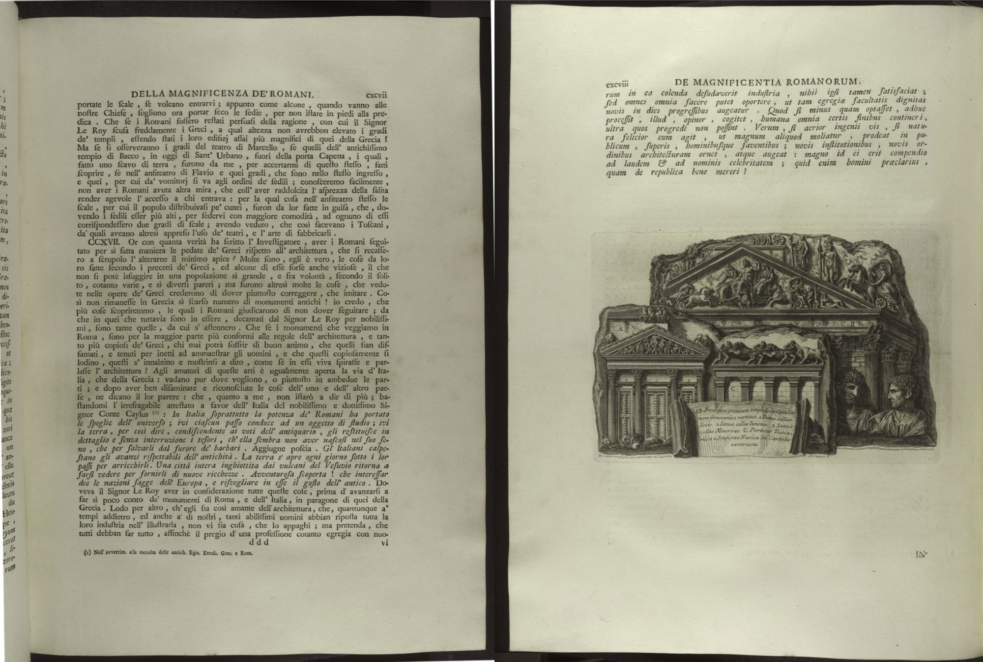
A further remark is the lack of pictures within the text. An entire chapter for photos is situated at the end of the book. There are only two pages on which there is a short paragraph accompanied by a single picture.