Task II
The Principles of Architecture by Peter Nicholson
General observations whilst studying Volume I
- Typography: ‘ct’ is consistently printed with a semi-circular connector, supposedly due to the print techniques of the time. To the annoyance of a modern reader when the lowercase letter ‘s’ does not appear at the end of a word it is printed as an ‘f’.
- Contents: Surprisingly, if we would replace the archaic terms, such as ‘thence’, the text itself is accessible to a modern reader. It would still seem a little odd, owing to the rather lengthy sentence structure and the different tone. The flamboyant and emotive language that also exemplifies a high degree of self-assurance of the author encountered in the preface is distinctly different to our more tentative and factual writing style today.
- Audience: the reader is assumed to be male, which is evident with the repeated use of the personal pronoun ‘he’.
- Chapters: each chapter starts on an odd page.
- Paragraph Structure: each paragraph commences with a capitalised word and finishes with a clear line break.
- Page Layout: relatively wide margins possibly leave the reader space to include their own remarks.
- Page Break: The last line in each page includes only at most two words and is aligned to the far right. If a page turn is necessary, the last word is repeated on the next page. The intention behind this is probably to allow for a fluid reading of the text. To a modern reader, who is not used to this style, it is more of a hinderance.
- Vacant pages: mainly towards the end of the book or on the other side of a graphic. In total there are 432 pages. Books were often printed in a multiple of 8, 16 or 32.
- Word format: already the title page makes use of a variety of font sizes, some draw the readers immediate intention with the use of italics as well as carefully chosen capitalisation/lowercase writing. This indeed seems sensible, when considering the length of the title. The use of such visual cues (particularly italics) remains persist throughout the preface. In a sense it aids skim reading, albeit this was probably not the intention of the author, who much rather wanted to highlight the crucial elements that his work addresses.
Chosen page spreads
The first excerpt chosen is from the preface ([14] iv and [15] v). Notably, the reader stubbles across a ‘c’ that appears in the final line. At first, I thought this was a misprint. However, in the next few pages it turns out ([18] viii) that this is in fact a later reference for the reader. In addition, we find examples of the italics used to stress the word ‘only’ and the capitalisation of the word ‘GEOMETRICAL’ is done to highlight that Nicholson intends to comment on the content of one of his central chapters.
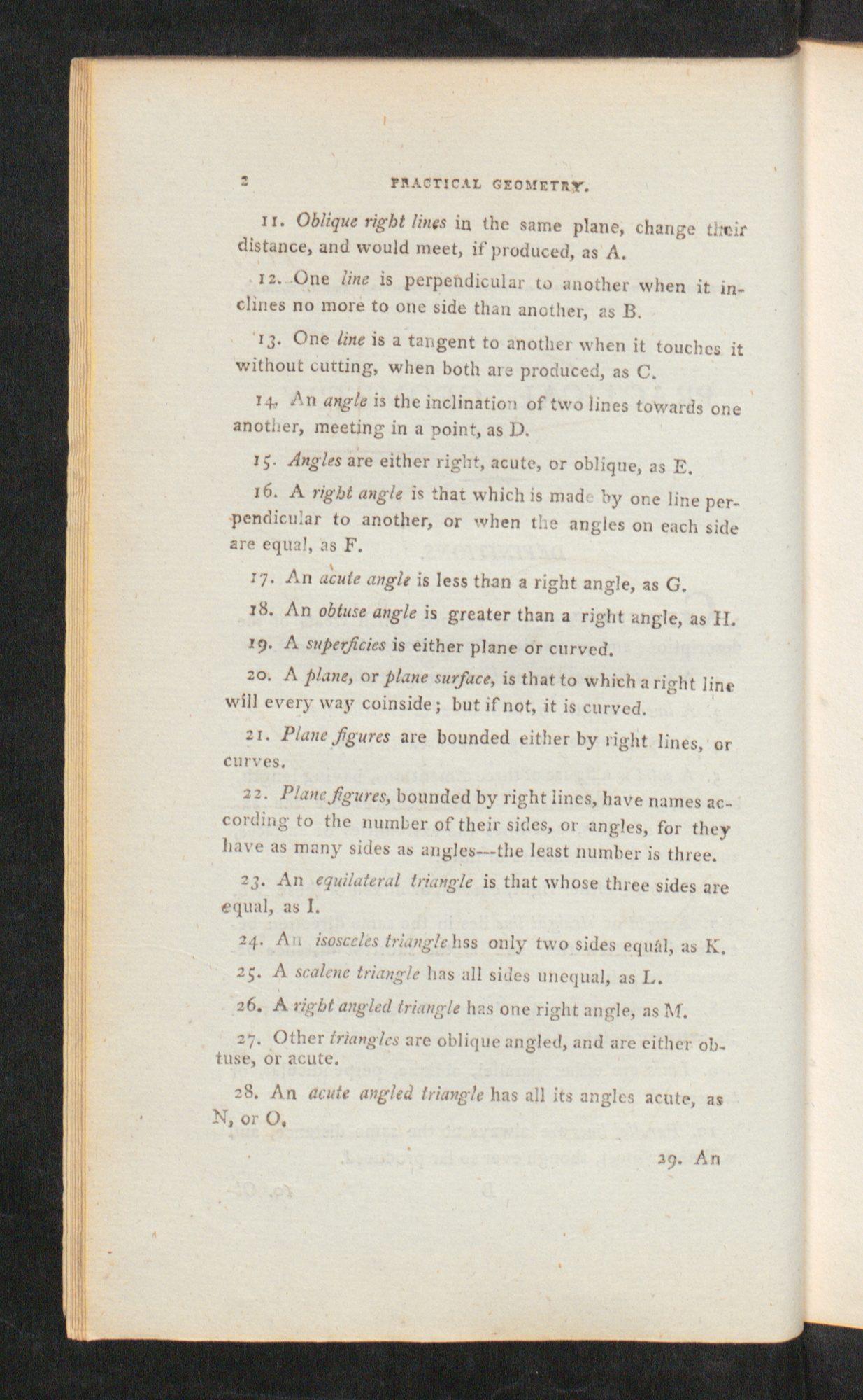
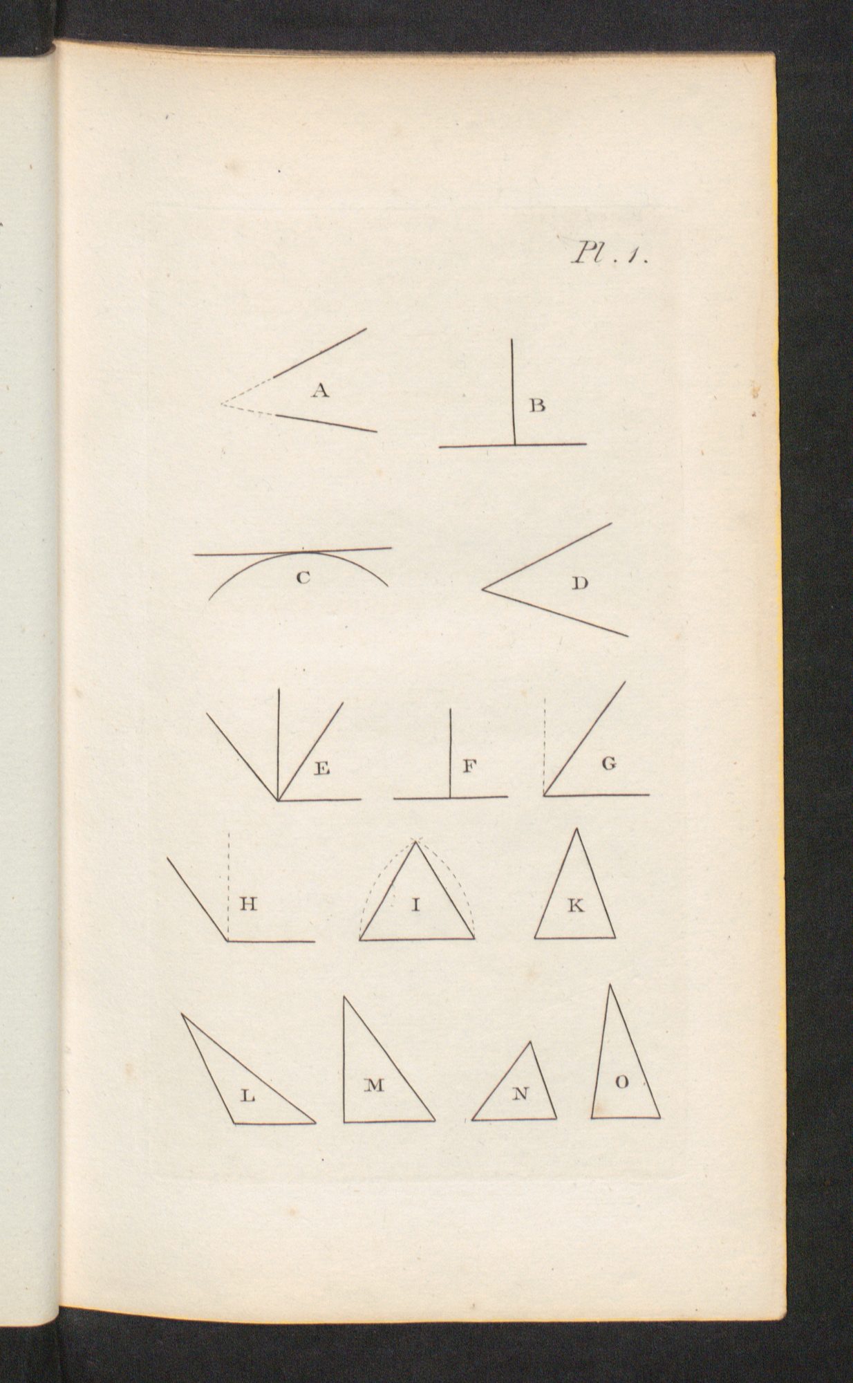
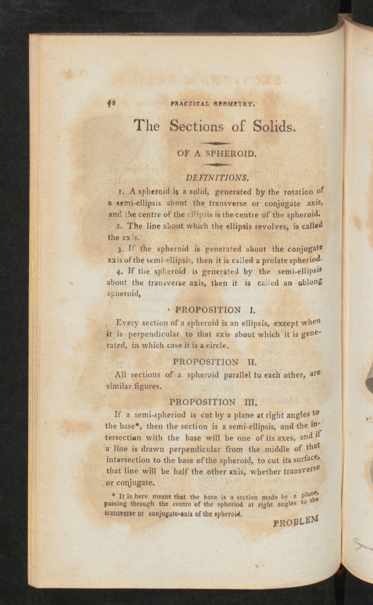
The second extract ([48] 2 –[49] 3) is from the practical geometry chapter. On the left side we see a systematic list of definitions, whilst on the right-hand side we see the visual representations. This textbook style continues. Gradually, the presented structures grow more complex, hence the importance of the visual presentation becomes increasingly beneficial for the reader.
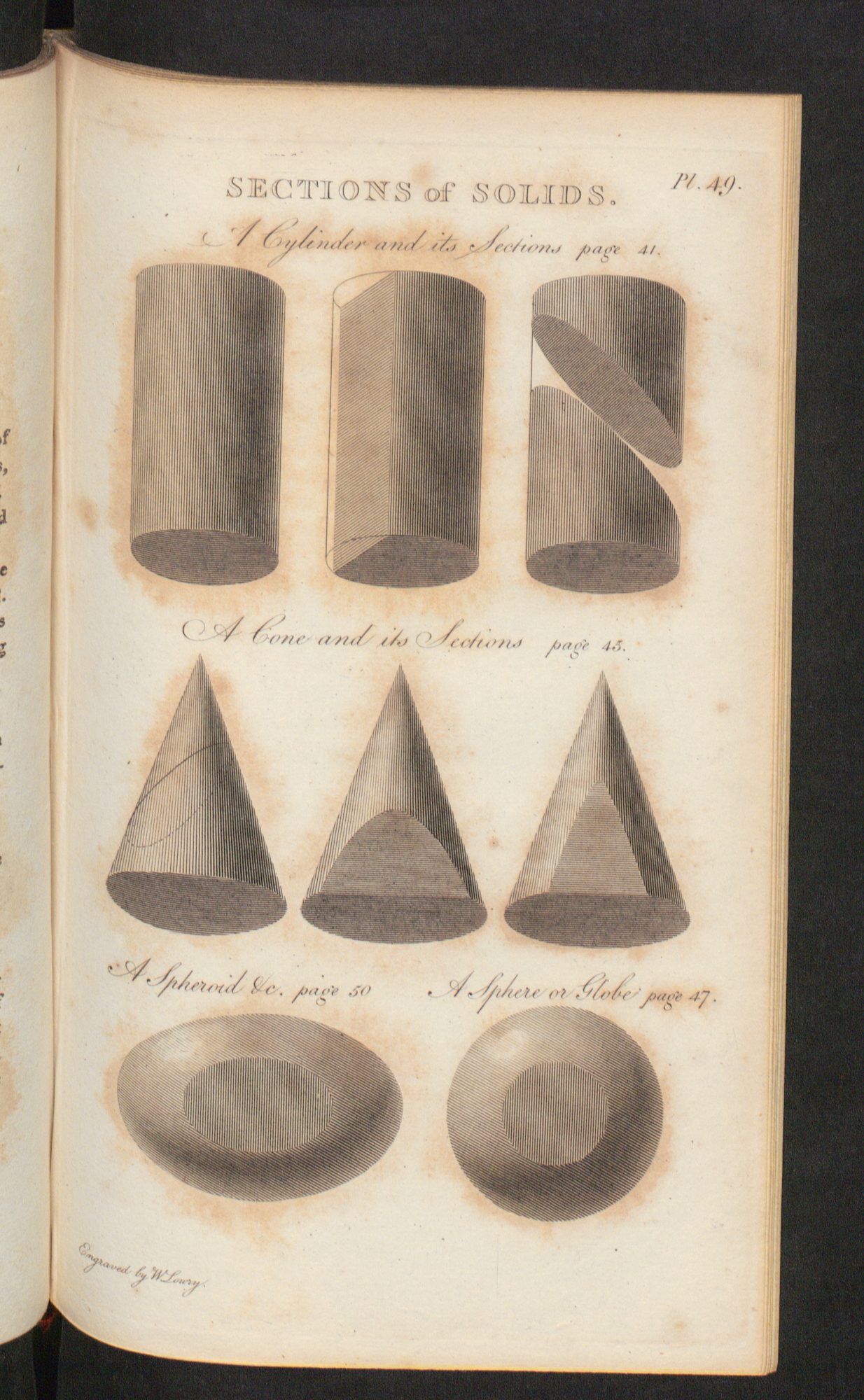
Most illustrations are simple line drawings, an exception to this occurs on [187]. The illustration here is even signed by ‘Engraved by W Loury’ highlighting that the author himself did not produce it. The shading used aids with the 3D visualisation of the respective cylindrical, conic and spheroid sections.
