

As I skimmed over the pages certain pages stood out or just caught my attention.
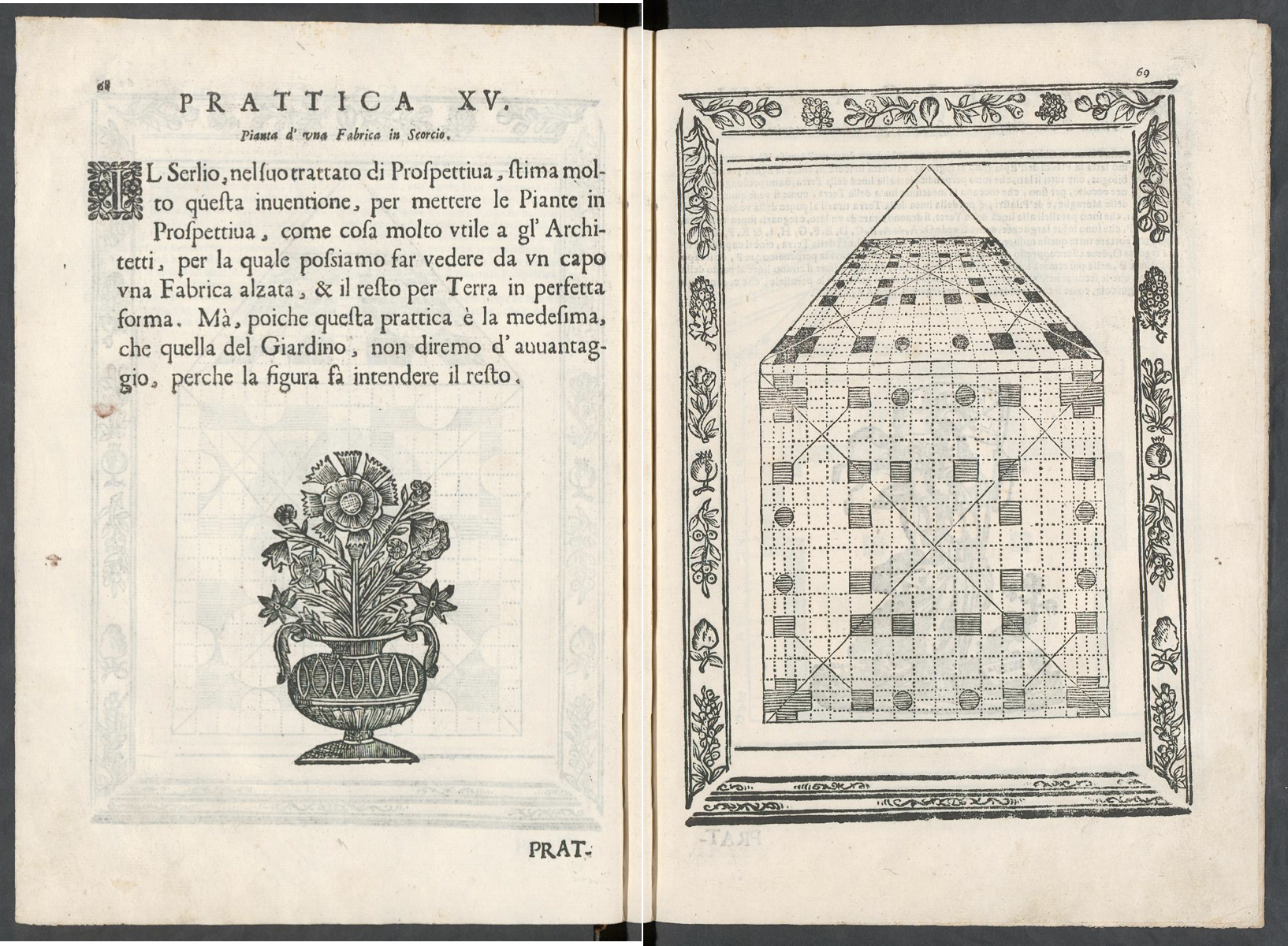
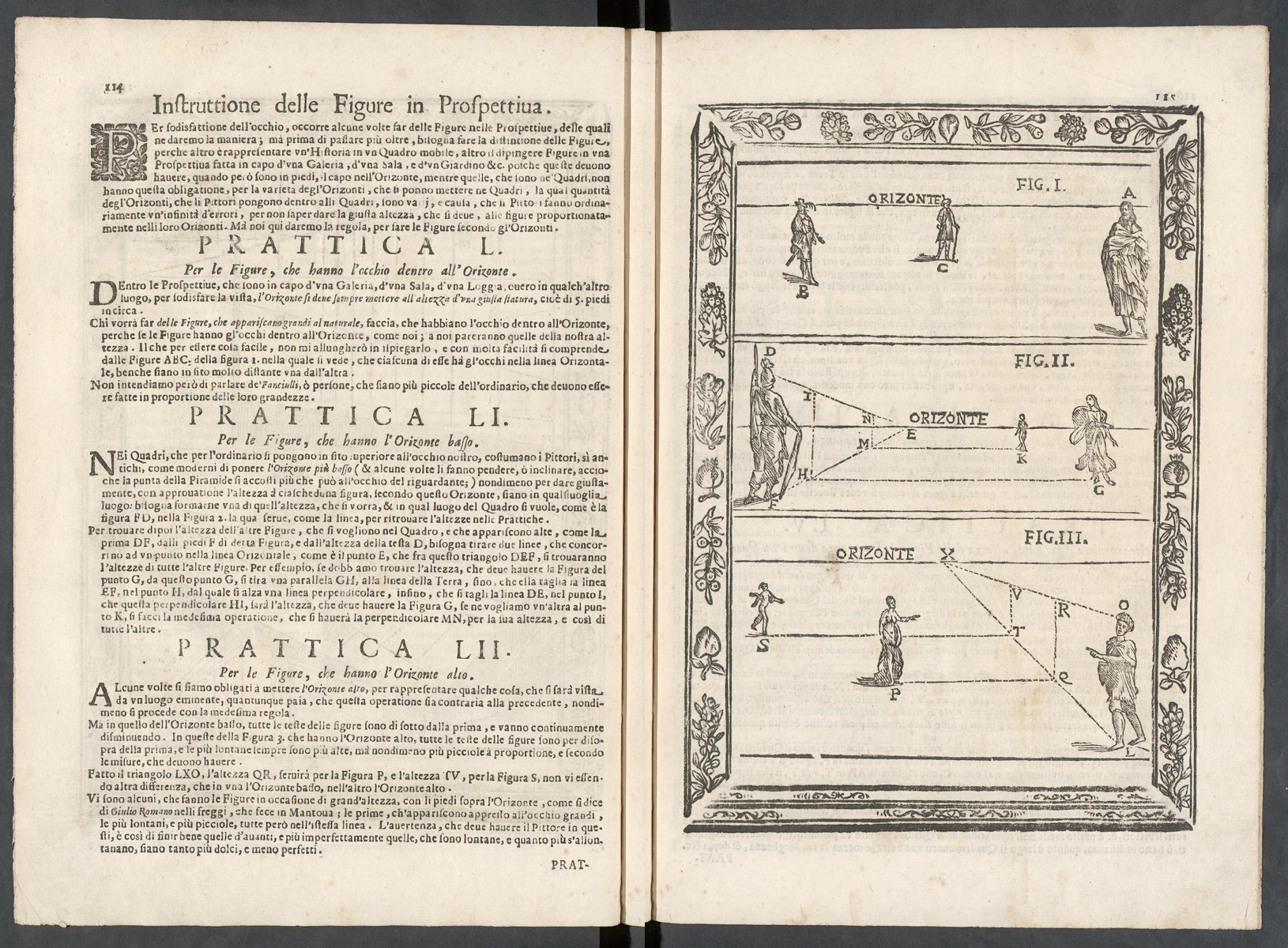
The whole book shows a certain pattern almost throughout the whole first half of the book, this pattern consists of a title, a small print text with a small illustration to decorate and fill the page on the right side, and a lavishly framed depiction.
As for the first spread that caught my eye, probably because of its sheer simplicity. The text is way smaller and therefore easily legible with an illustration of an ordinary vase to decorate the page. However, the right side doesn’t differentiate much from the ones before.
In a similar vein, the second spread drew my attention, not because of simplicity but because of the tidy layout. A paragraph for each depiction, a subtitle for each paragraph, and a short introduction. The depictions themselves are so clear and comprehensible that even though I don’t understand a word, I apprehend the topic.
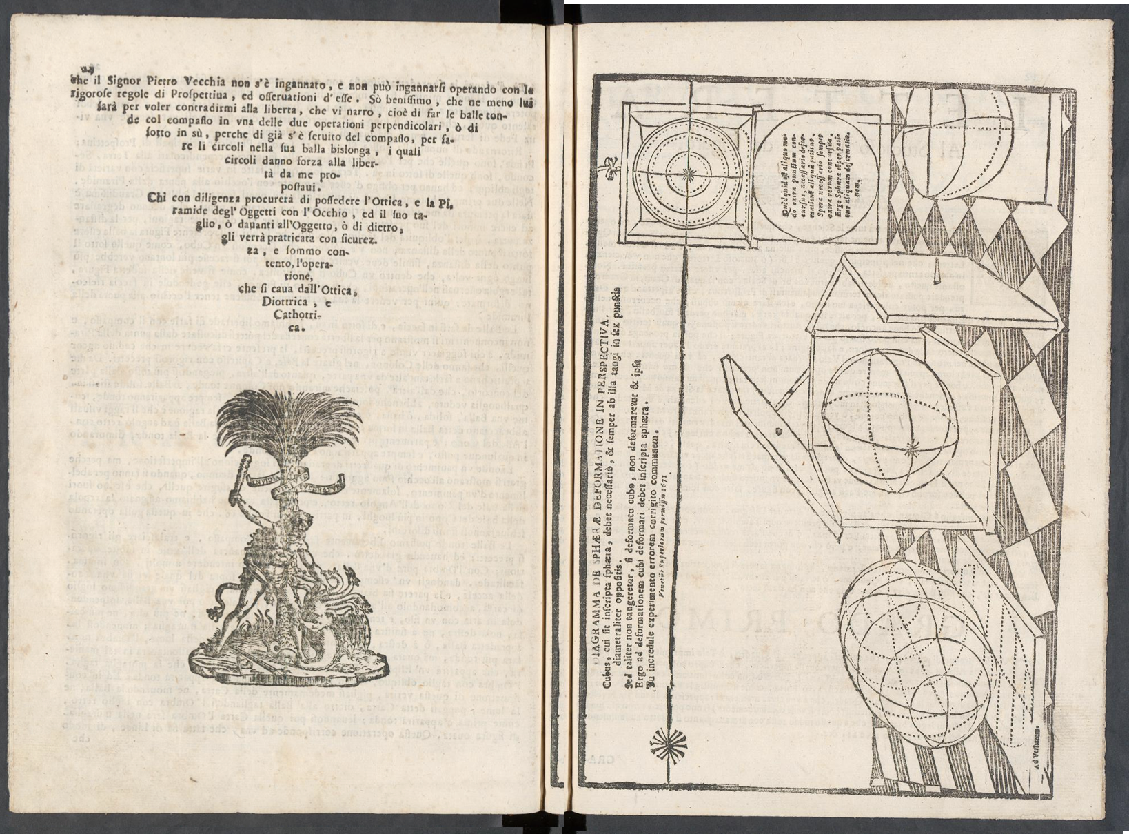
Last but not least, the third spread, which seems to step out of line, piqued my curiosity. Instead of displaying a normal text page, a text in the form of a poem took its place. Even the depiction varies from the others. It simply changed its alignment and isn’t accompanied by an ornated frame like every other full-page depiction.