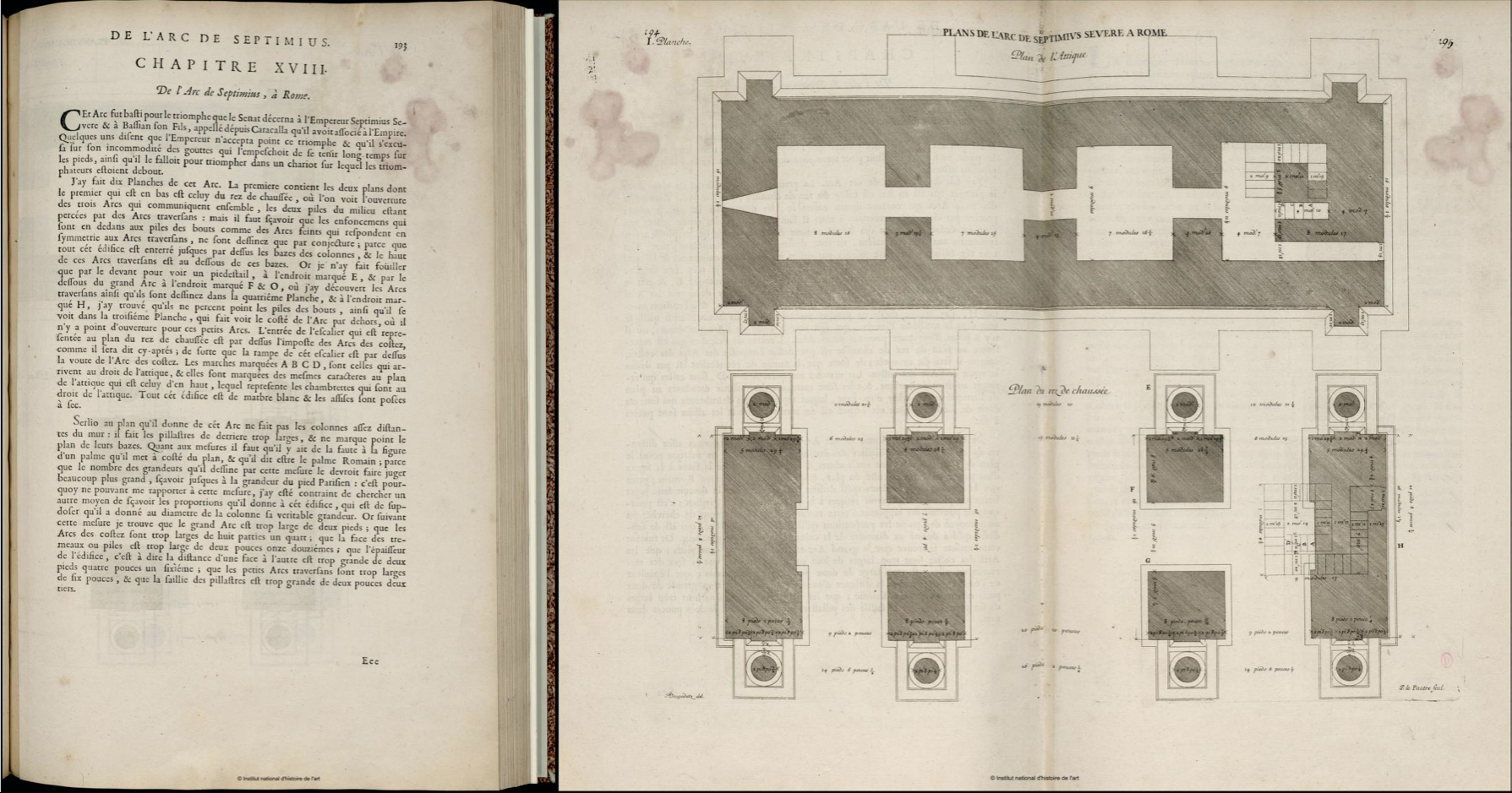
The second extract is showing the most often used layout for a double page. On one side there is the descriptive text and on the other one there are the corresponding pictures. I’ve been astonished by the precision the drawings werde made with. The measurements and the scales of the plans are very small, but they were made amazingly accurate.
This last choice of two spreads showing a big drawing and a ground plan each drawn over a double page is my favorite one. In my opinion big and accurate illustrations corresponding to the analytic text are essential for this type of book. Just because I value this important aspect so much, I took the liberty of taking two examples to underline its importance.