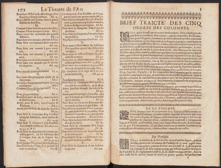
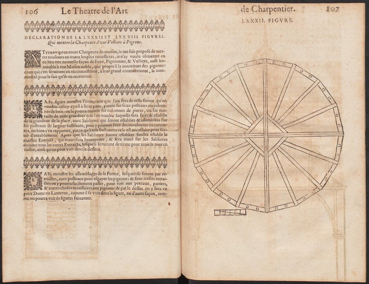
After looking a little more closely at the book, I immediately spotted the large, artfully designed letters which mark the beginning of a new section (p. 106, p.01). They seem unique and yet they seem to follow a regularity. The particularly striking templates between the text sections are equally fascinating and eye-catching (p.106, p.01). The usage of capital letters enhances the importance of the sections and lets the paragraph stands out from the uniform text.
The many sketches of various buildings are also very impressive (p.107). Those designs possess a strong expressiveness even though they are neither shaded nor coloured in any other way.
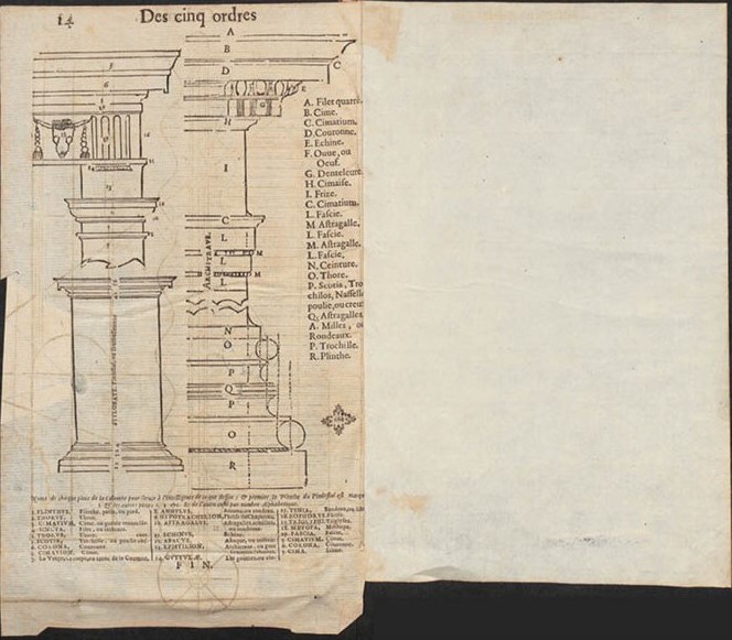
Due to the layout, which is used for most of the Book, a large rectangular body of Text forms on each page (p.106, p. 172, p. 01). Both sides of the Text leave only a small room for margins. In addition, there are no footnotes, neither at the end nor at the side of the paper. The Book has two different parts. The first ends with a few index pages (p.172). The following pages are structured differently. Those eye-catching templates between the text paragraphs disappear and the chapters are much more reminiscent of a characteristics record (p.14).
Brikena Avdija, 18-123-778


