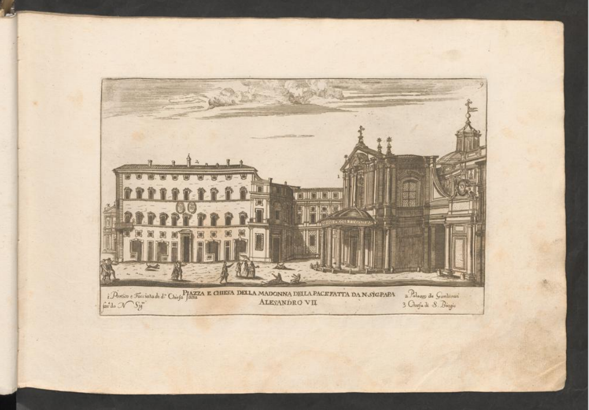
The first thing I noticed when going over the book is that throughout the book every spread consists of only one drawing on the right side with a bit of text underneath it. On this specific page, discoloring is visible on the left, so I assume this kind of spread is to prevent discoloring onto another drawing.


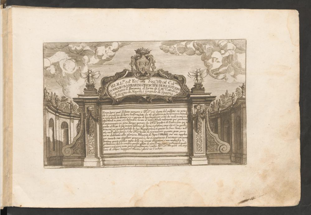
The fifth page stands out because it’s the page with the biggest text in the book. It’s interesting how the text isn’t presented by just writing on the page itself but rather integrated into the drawing.

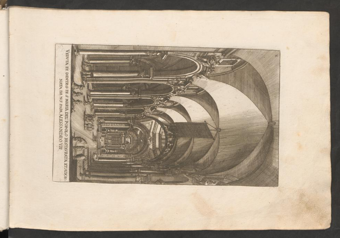
A few pages into the book this page catches the reader’s attention because it’s the first one that is aligned horizontally and forces the reader to turn the book so he can also read the text underneath the drawing.
