These two successive pages caught my attention mainly because of the many different formatting. The titles are written in a large font and positioned centrally, while margin notes have space on the page. The texts are very short, and it doesn’t look like a book directly. More like several notes that were put together afterwards. On the left side, there is still a faint trace of a text that may have been printed on the next page or that was previously in this location.
On these two pages you can see very well the different ways the author has chosen to present his work. On the left side it looks rather unstructured, while on the right side a clear structure and division into title and text can be seen. On the left side you have more the feeling to see different notes of the author. As if he had captured his thoughts with different unconnected sentences.
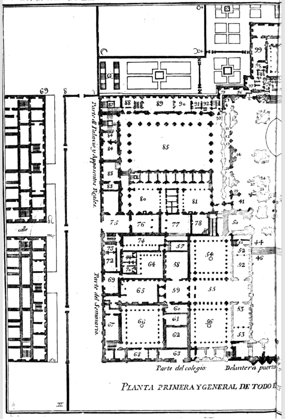
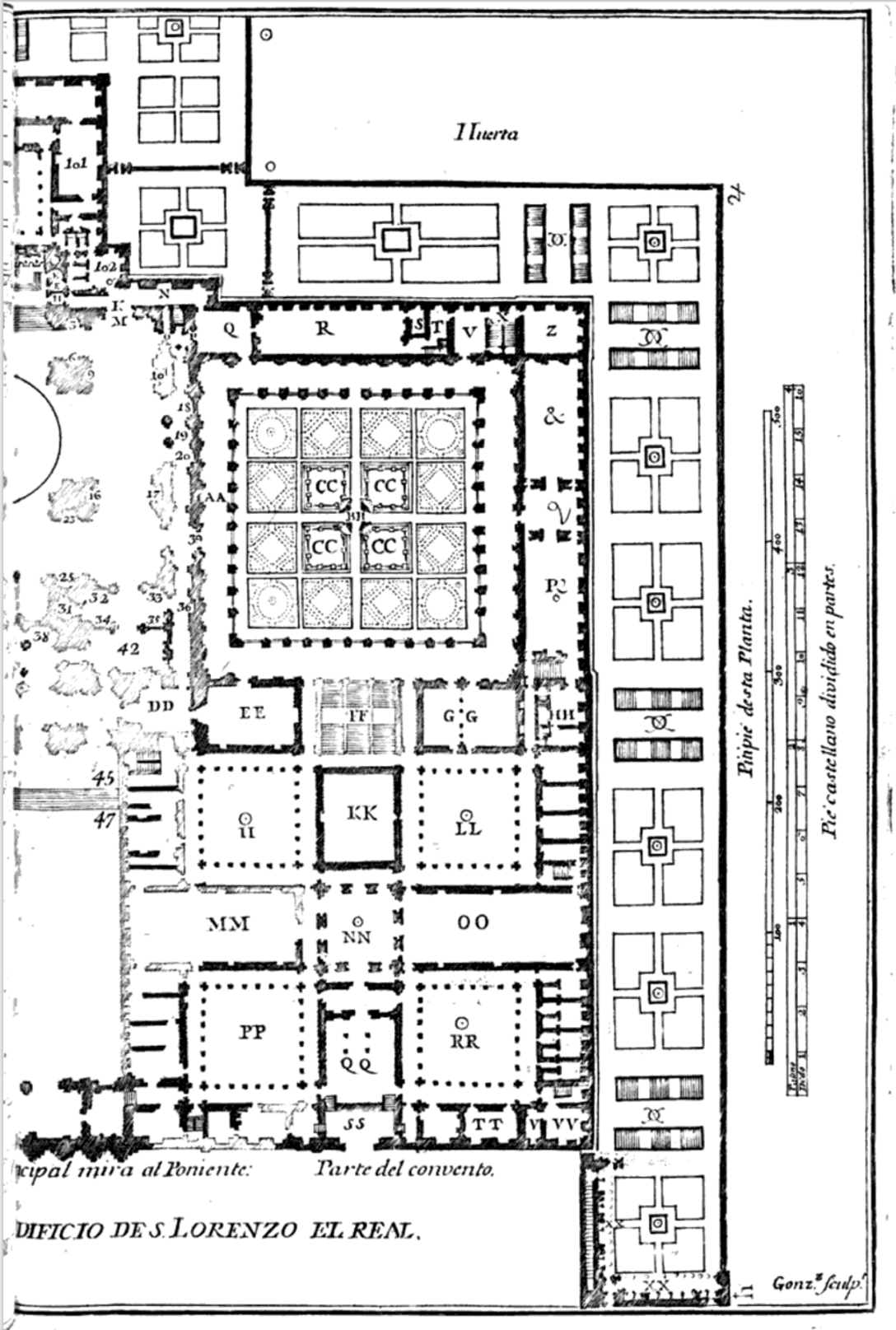
With this spread, I was impressed by the way it fills two whole pages of the book for a floor plan. It is striking that he uses the page for his drawing almost all the way to the edge. Also impressive is the accuracy of this plan. Different thicknesses of the walls as well as individual small niches are clearly visible. Furthermore, the inscription of the rooms of the building is exciting. While he uses mainly numbers on the left, he uses more letters on the right hand side for the marking of the individual rooms.