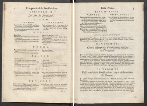
On the first page of the second chapter, the author plays with the different fonts in the title and in the corresponding subtitles. This structure of title and subtitle in different fonts runs through the whole book when new chapters begin. This explicit page differs from the rest of the book regarding the structure and type, as it is an enumeration rather than a continuous text.

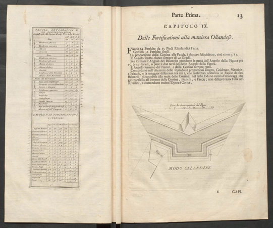
Due to the tableo on the left page it appears much clearer and user-friendly, makingit stand out. In addition, the page seems to have a different size then the rest of the book.
Another interesting page is the one with the handwritten notes and calculations. Normally you don’t see this kind of thing in books but it’s interesting to be able to follow the authors train of thought.