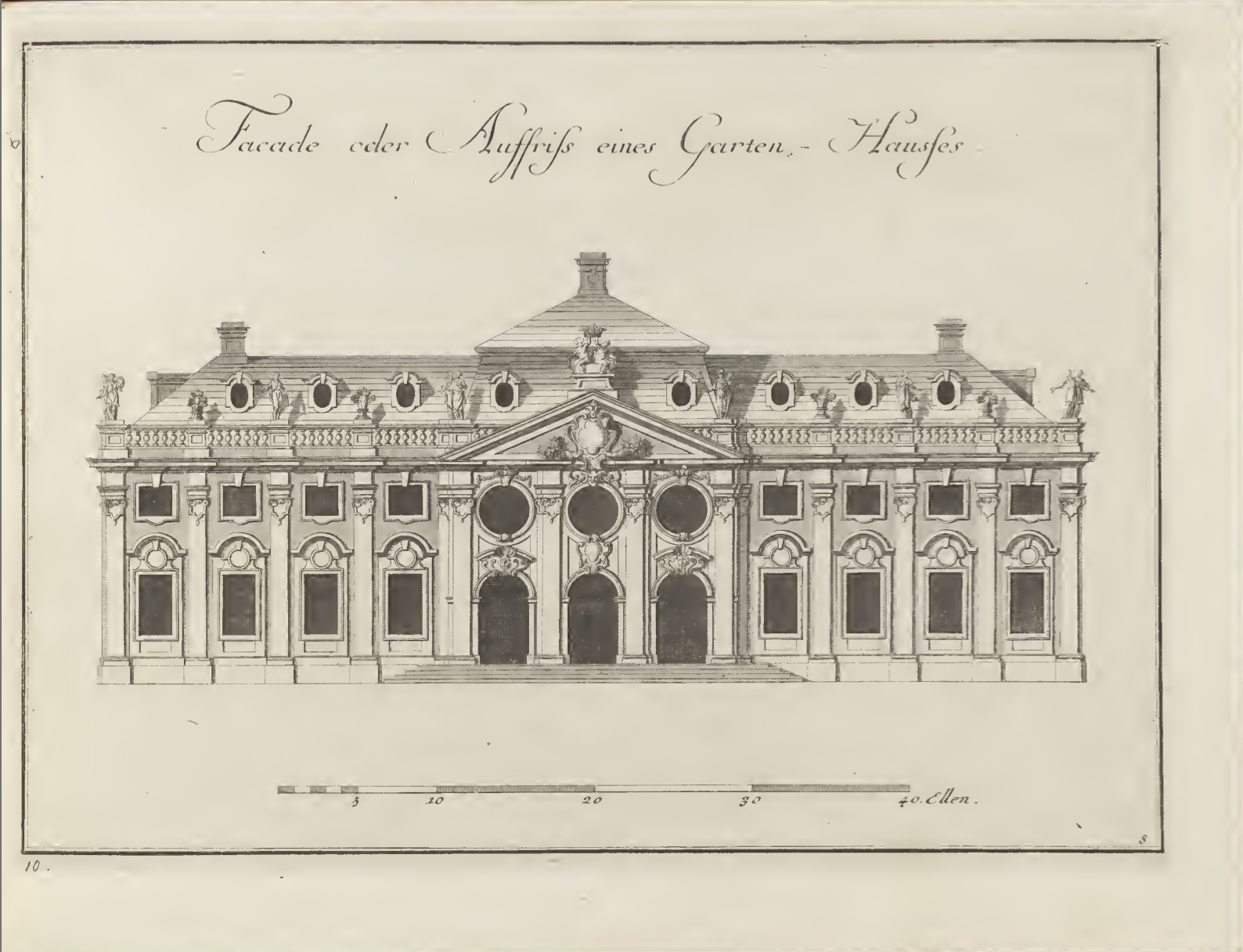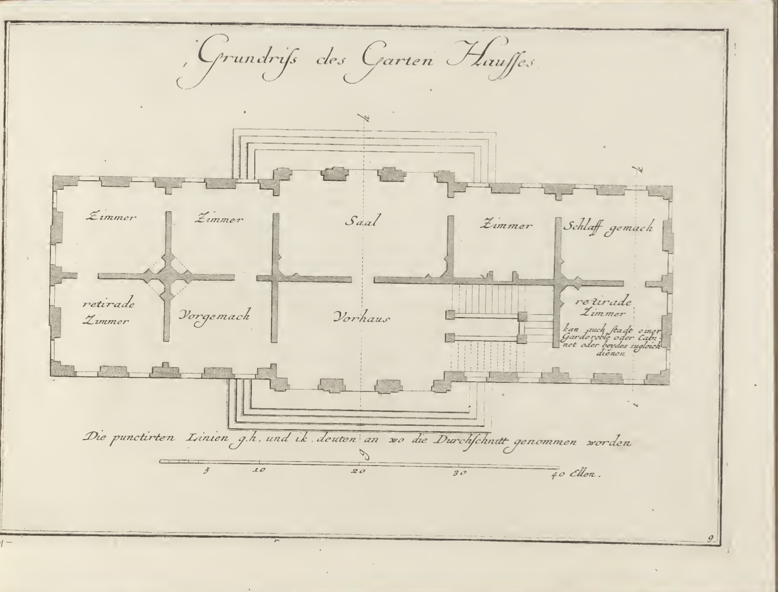

In the first part of volume 1 there is a reoccurring trend of comparing an elevation and plan of a building. This spread specifically caught my attention since the layout of both the drawing and plan are the same, making it easy for the reader to understand the structure of the building.

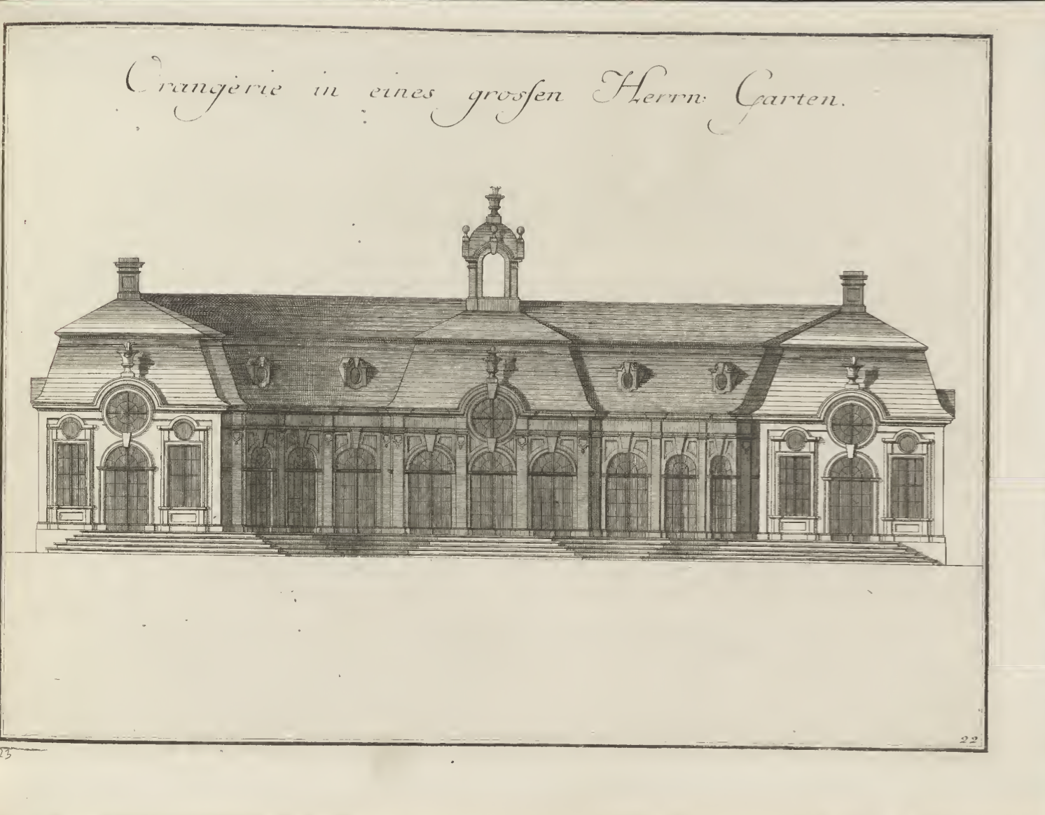
The next spread (this is the third page to the ones above) definitely is an eye-catcher in this volume since it is the first cut-section that is shown, thus is drawn in rather darker colors and one can now also see the interior of a building.


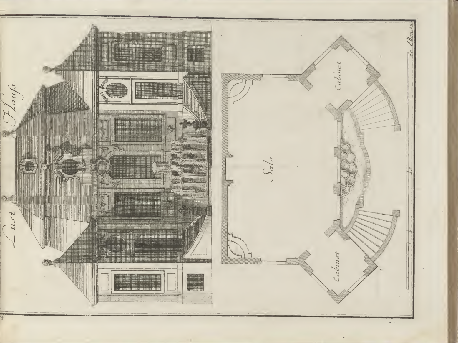
This next spread was particularly interesting because there was a sudden change of layout. The image is now aligned vertically and now both elevation and plan are on the same page, meaning that the scale is different to the ones in the first part of this volume.