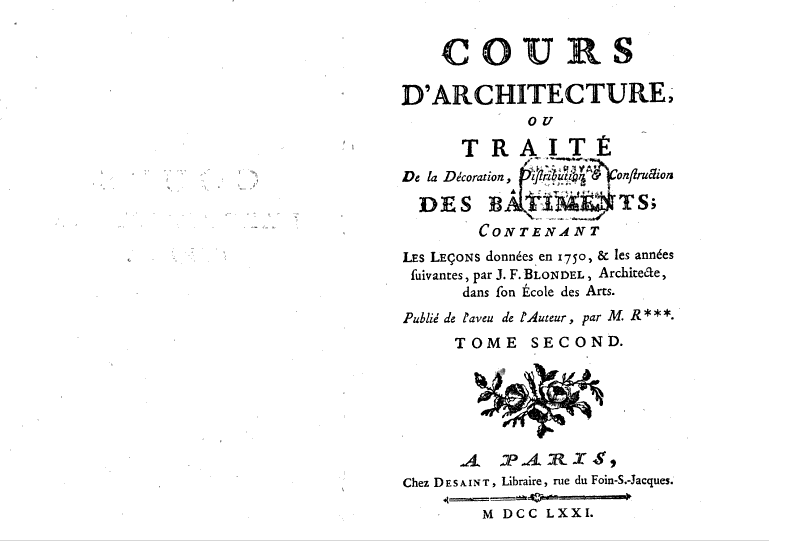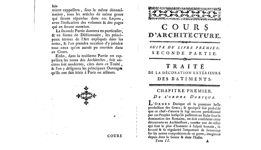


I chose these three spreads because they nicely show the different layouts within the book.
The front page shows the title and relevant information the reader might need to know. Upon first look the page seems slightly chaotic, with different font sizes, styles and decorations such as rose branches and a page divider.
Then after a while the layout of the book becomes quite boring, with pages filled from top to bottom with hardly any breaks, creating no distinguisable structre for the reader.
The book is divided into different parts. Once one part of the book is finished the next one is introduced with, once again, an elaborate title and decorations that nearly take up the entire page.