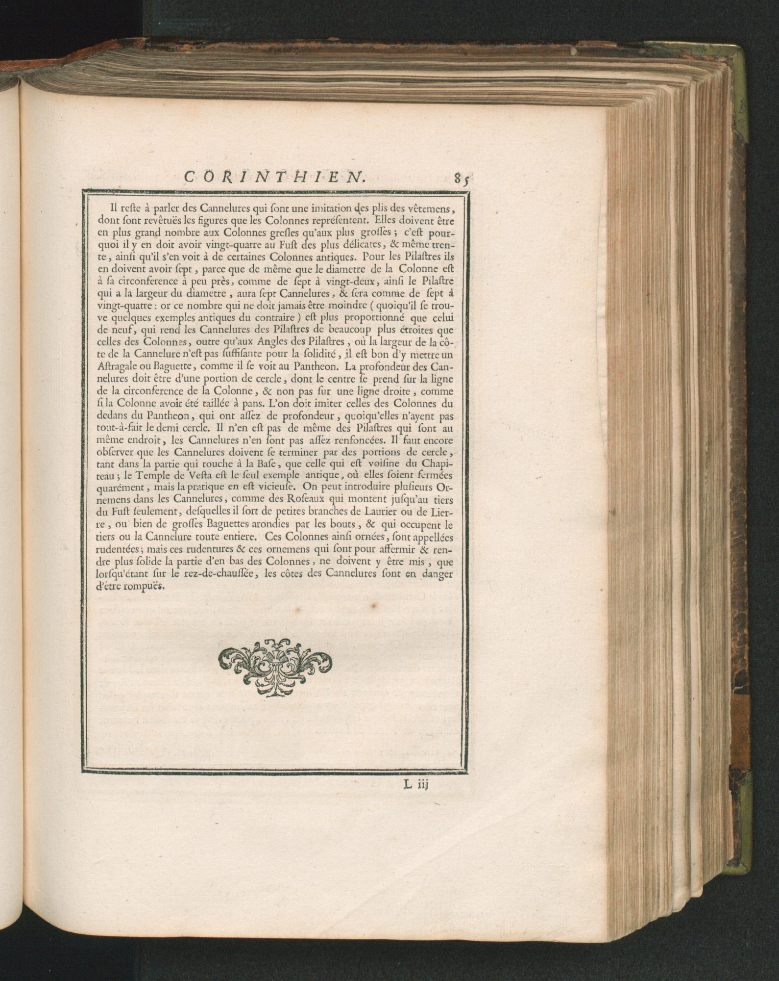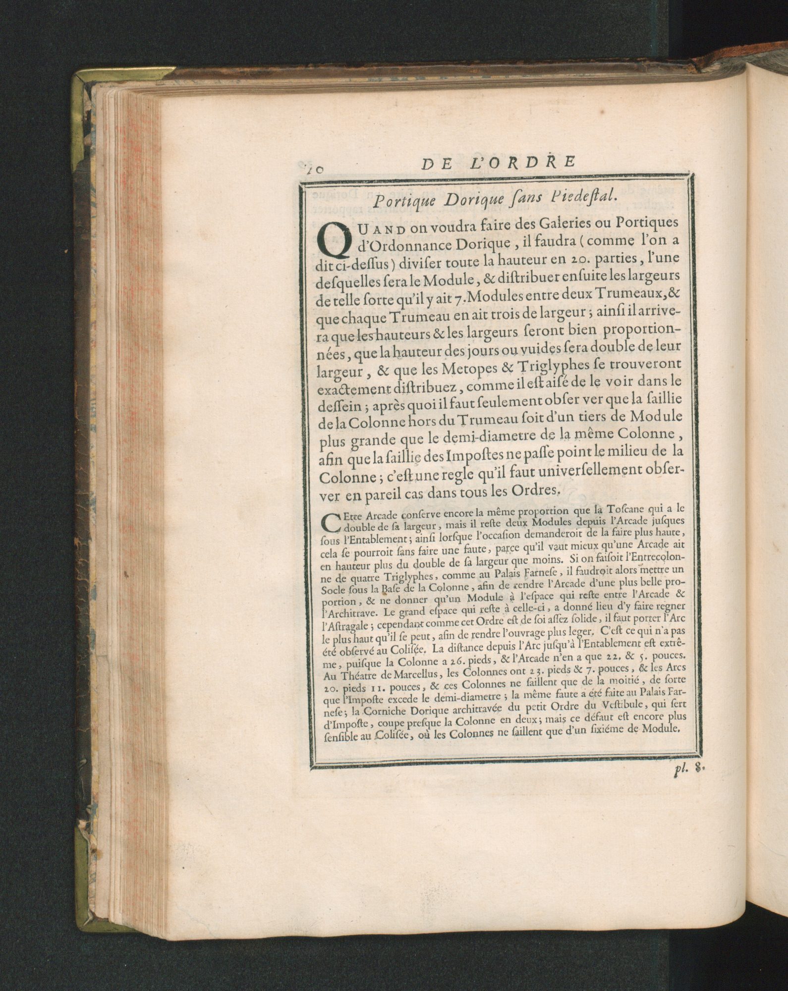
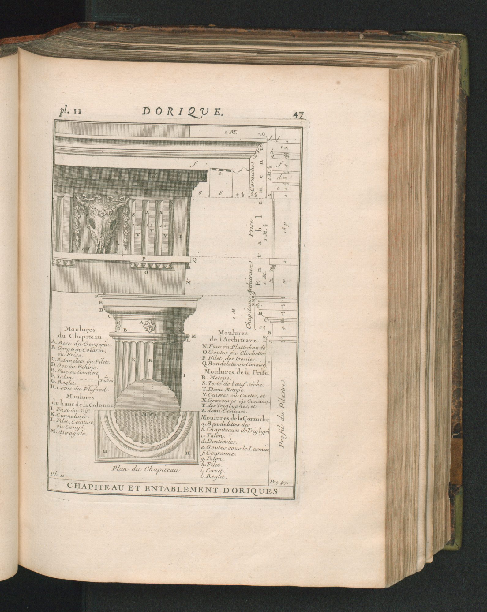
Pages_Cours d’architecture - Archived Posted on 11/03/202009/13/2021 This page caught my attention because it includes a great amount of text and many different fonts. There are more pages in the book that look like this and you could ask yourself why the author didn’t enlarge the frame so that the text could be written bigger. On the other hand, it must be said that there are different paragraphs and for every section a different font/ font size is used. So, the page’s appearance is very well-structured and it’s not necessary to enlarge the frame. This page seems interesting to me because of the way how it’s painted. There are some further pages in the book which include pictures like this.It looks like all important aspects are mentioned and all details are described, but it still looks very good organized, too, and not confusing or unclear. I like it how even the smallest forms and illustrations are labeled precisely. This sign appears a lot in the book. It can be seen in many different variations and I wonder if all the differences have a special meaning…In my point of view, the general meaning/ function of these signs is to show the reader that one topic/ chapter is over. Furthermore, it has also a visual function; The size of the frame is on every page the same, but if the author didn’t use these designs the undermost part of the page would be empty. So, they kind of complete the pages where there’s not as much text written as on other pages.