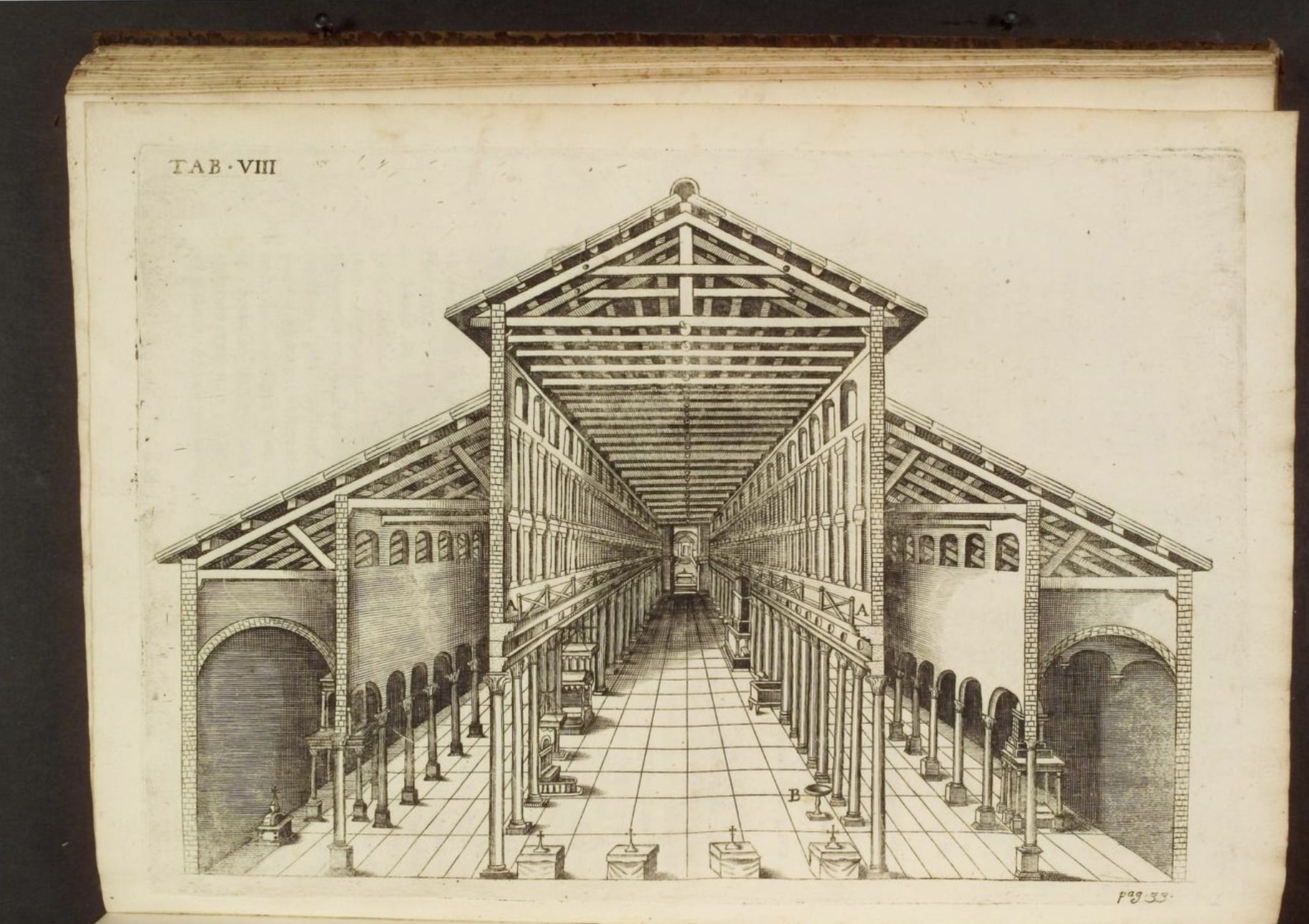
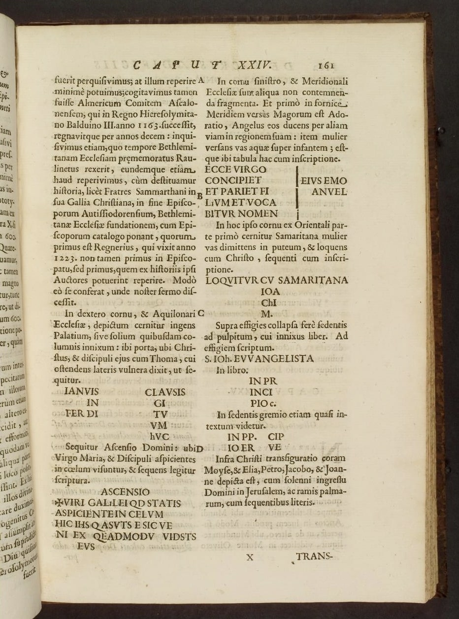
I decided to pic one page with an image and one with a text on it. I like the image because of the way the building is represented and the depth of the building is impressive. As for the text page, I like the layout and how some of the words are written in capitals and ordered in an unusual way.
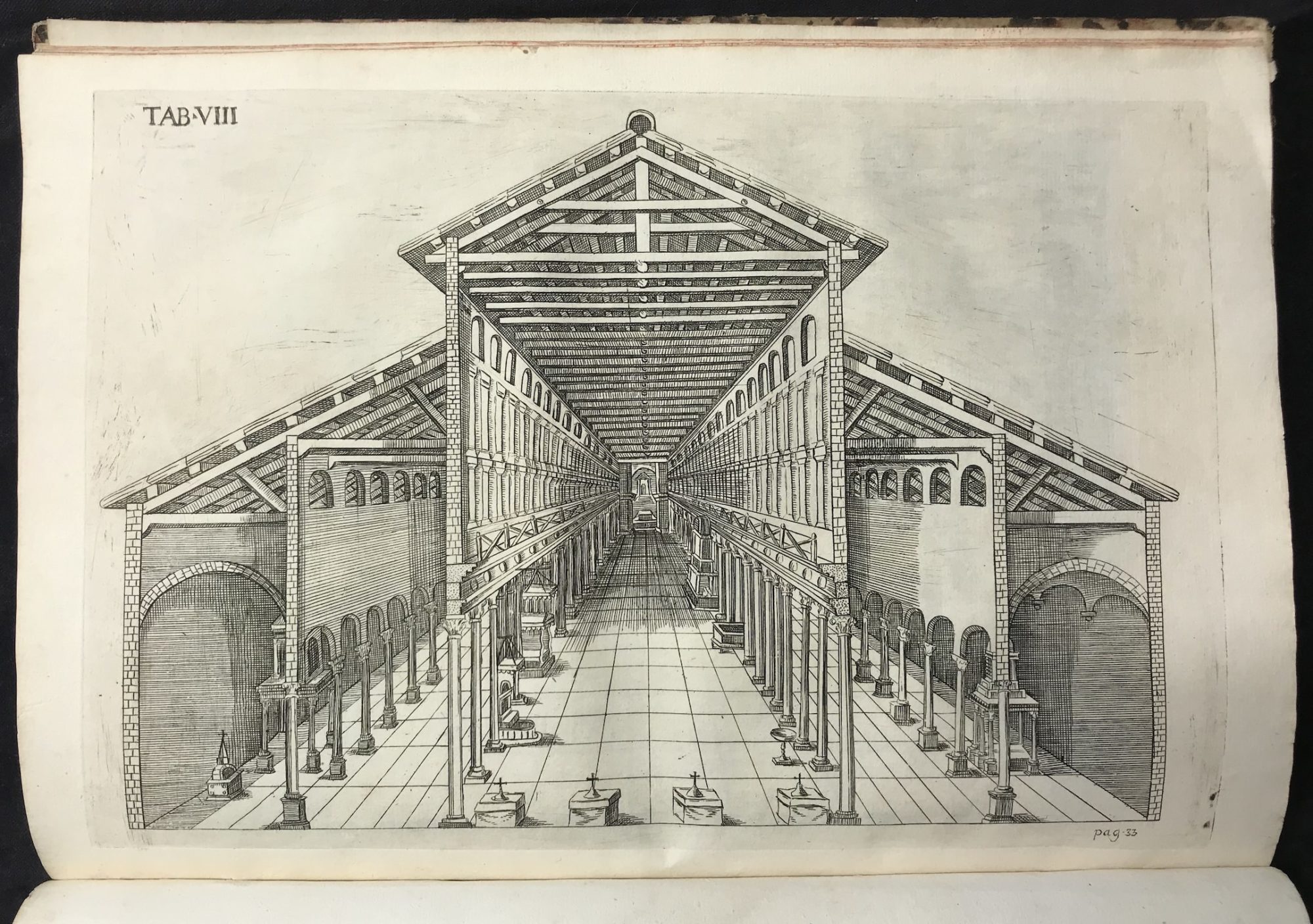
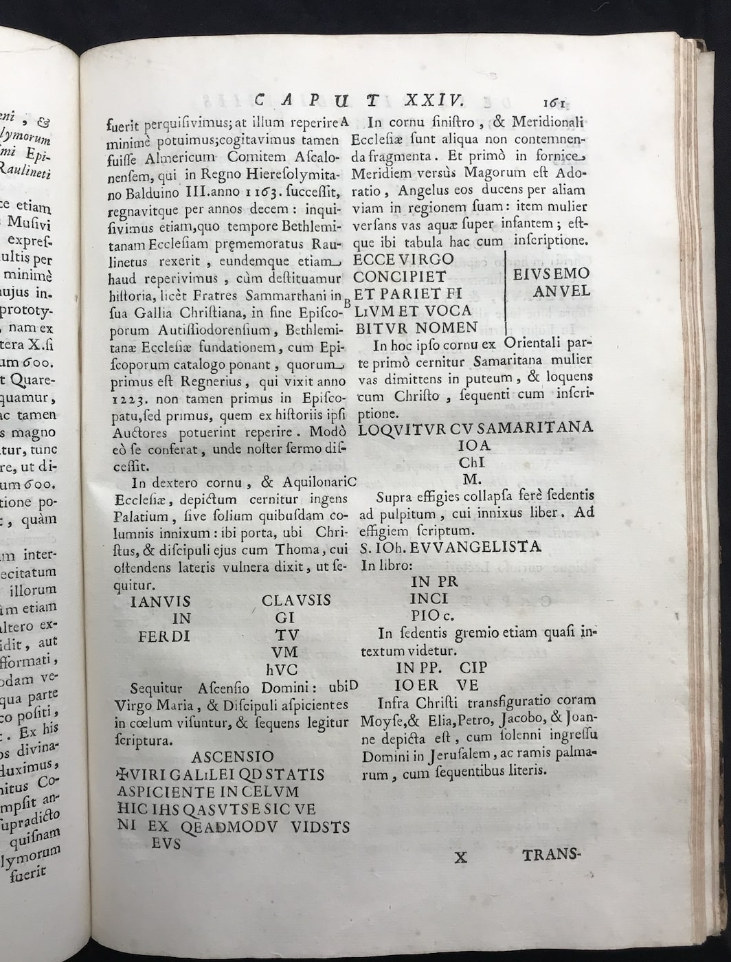
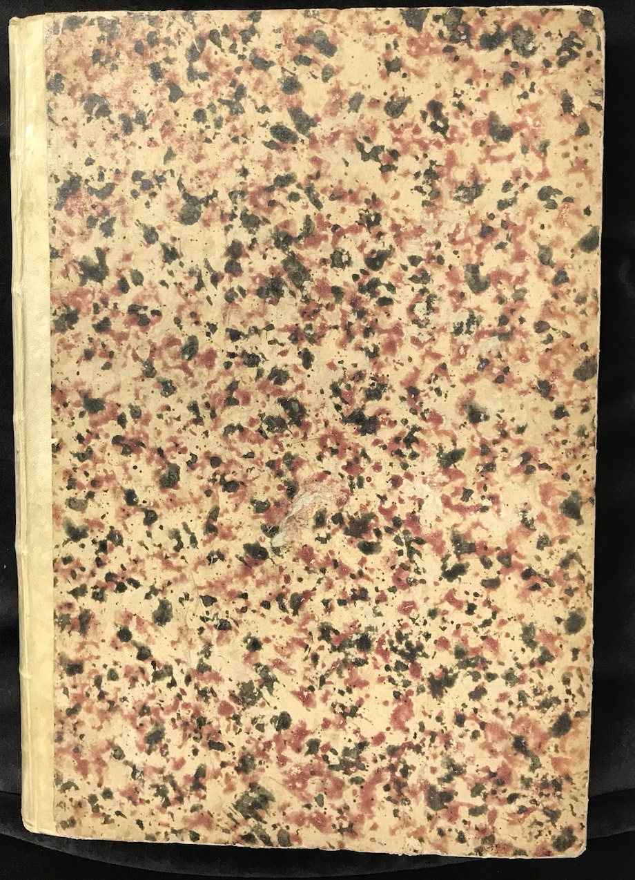

The book is covered in a strong brown cover with black and red spots. The pages are quite thick and dyed red on the side. It is pretty big and heavy for having about 200 pages.