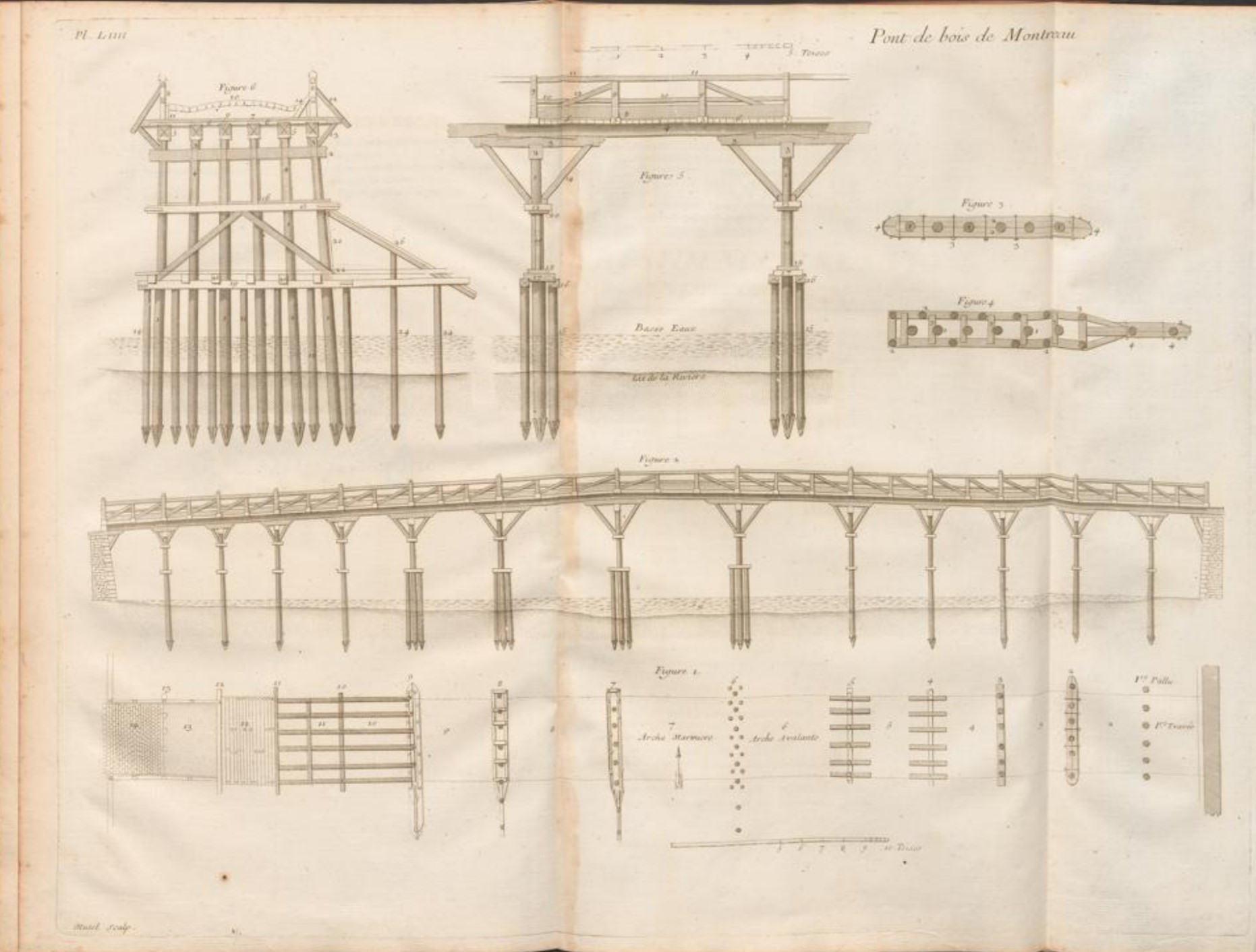
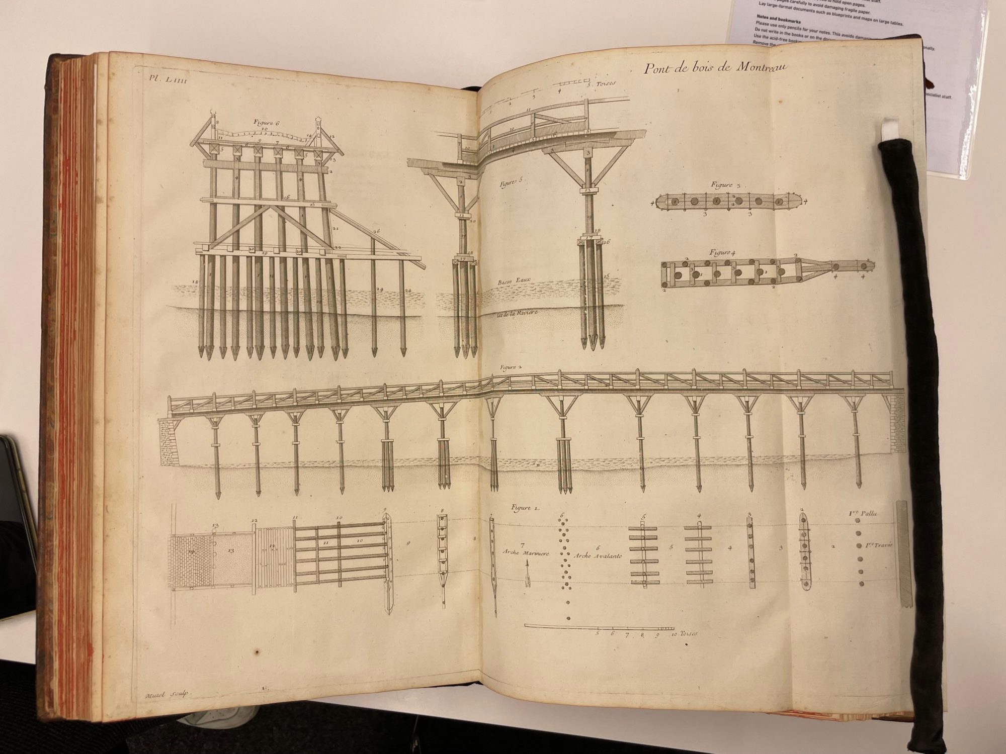
This illustration is on Page 188 of my Book. As far as I can tell it is a depiction of the wooden bridge in Montreau. I chose it because it is one of the few examples in this book that showcase not just a plan, but also gives an explanation of how the bridge functions and its components.
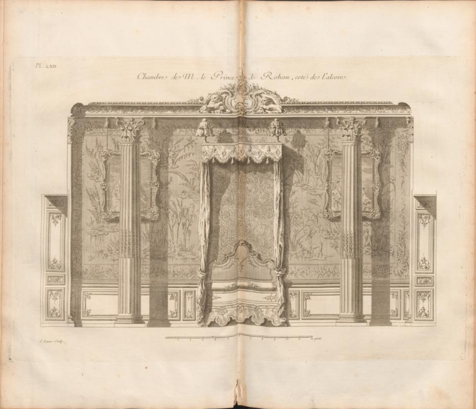
This illustration is on Page 207 of the book. It is very much in contrast compared to the schematic view of the wooden bridge on page 188. It depicts mainly decorative elements of what I believe is a bedroom with two alcoves at the sides. I picked this page because the illustration is incredibly intricate and it completely contrasts my other pick.
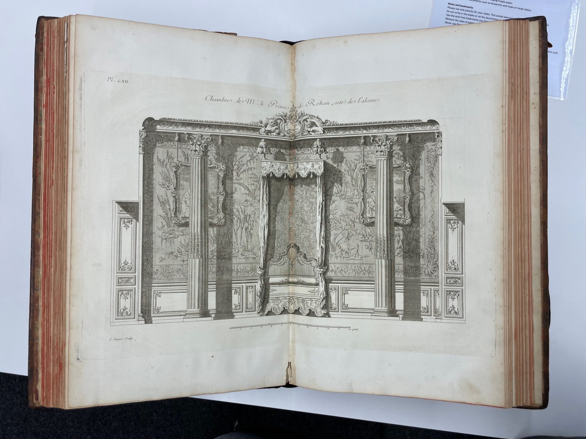
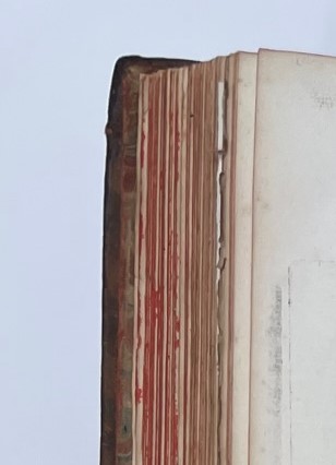
As a detail, I chose to take a look at the discoloration of the pages. I thought it was interesting how without the influence of dirt and just normal use such a contrast in the edges of pages and their ends could be created.
