When I first browsed through the book, I instantly noticed that the text is printed more to the middle than to the sides. This is repeated in the whole book. Also the text is a bit askew on each page. Furthermore, there is a title on the top of each page which is written in captial letters.
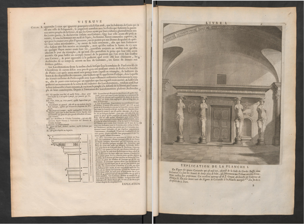
Next, I noticed that there are several images, probably to exemplify what was written before. Sometimes the image is very small and included into the text, sometimes it fills a full page.
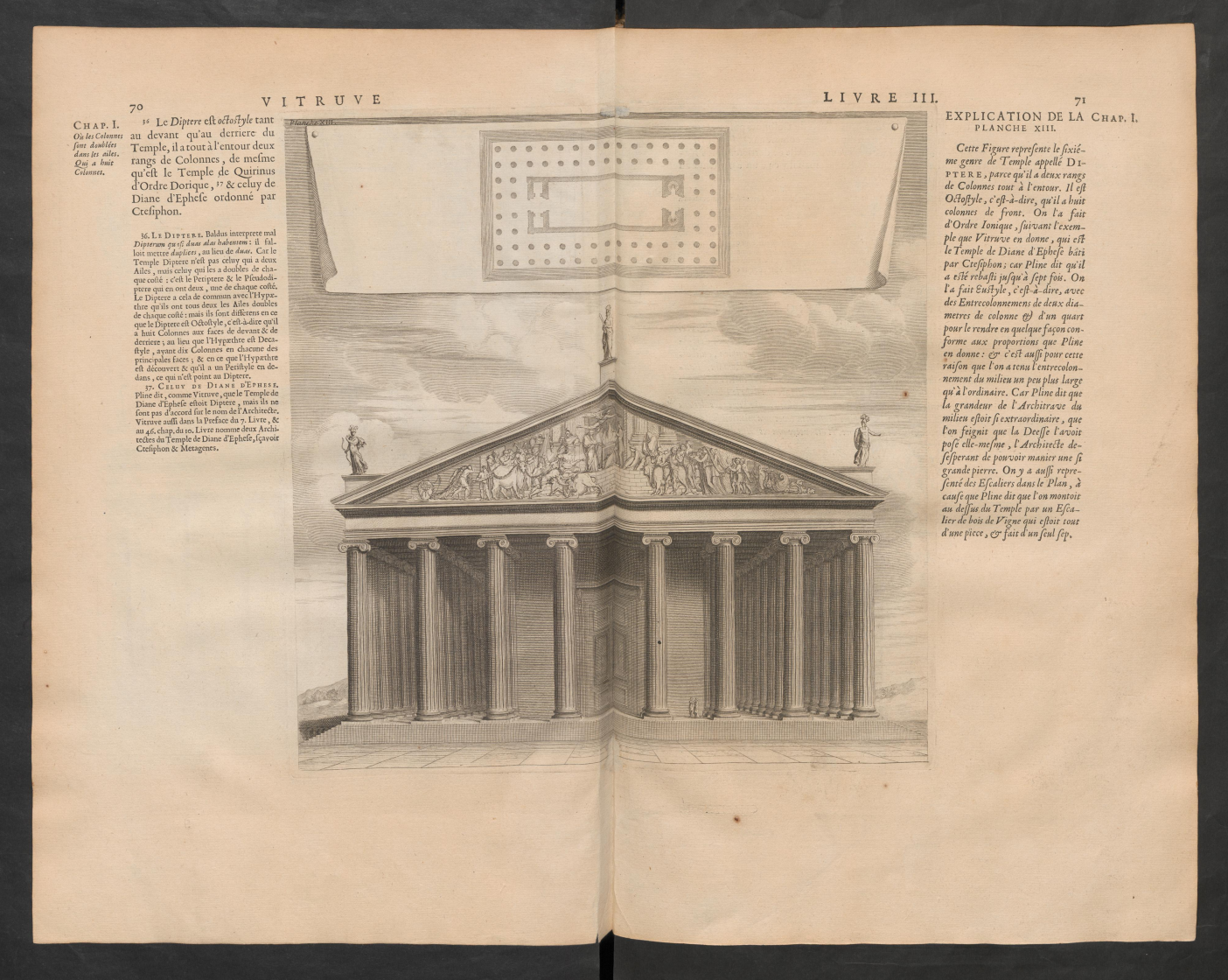
In addition, there are few pages catching the eye by a bigger image extended over two pages.