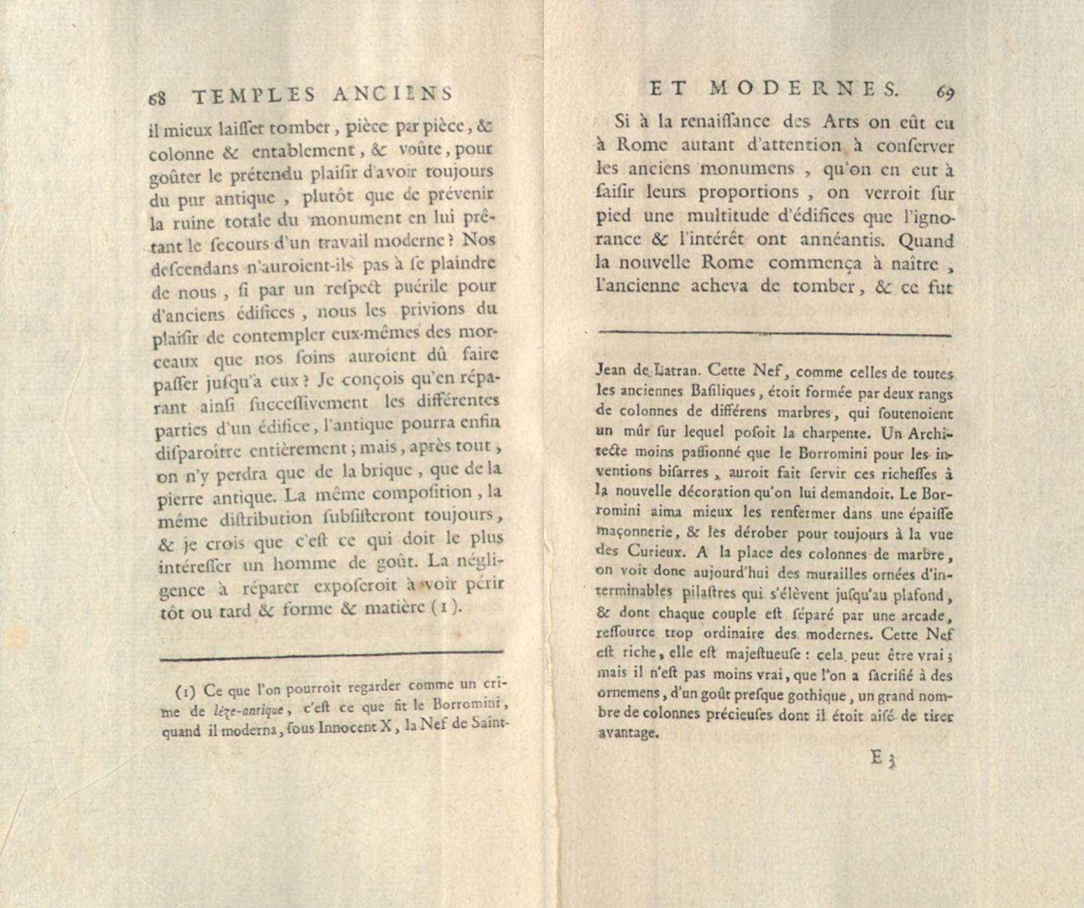
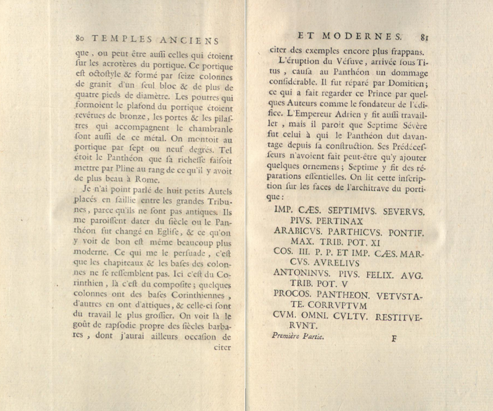
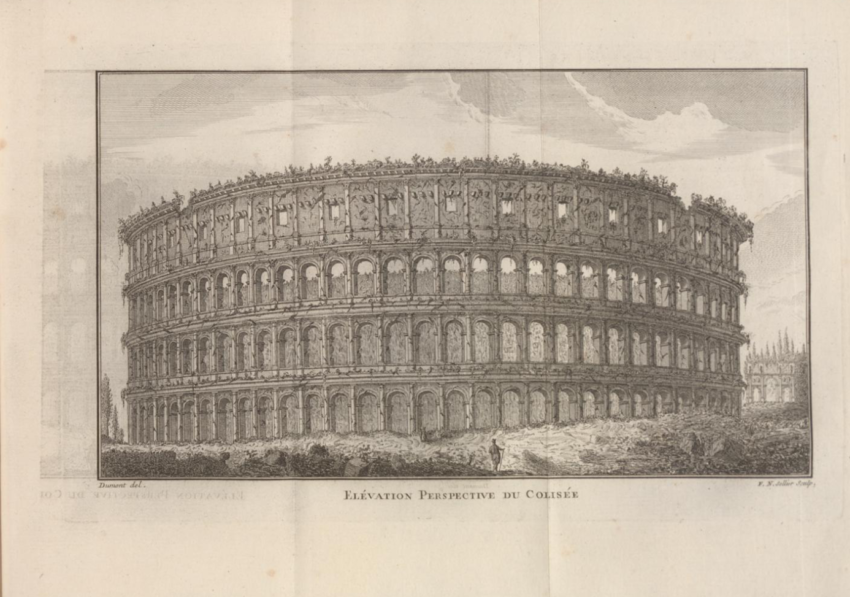
When I had a closer look at the old book, page 69 caught my eye. On this page the main text is very small and the Footnotes take up a larger part of the page. The comparison becomes even clearer if you look at page 68 next to it. It almost seems as if the author had forgotten to include important information in his text and had to add it at the bottom. Since the book has very few illustrations, the detailed drawing of the Colosseum stands out. Also, in the hatched drawing, a dimensional figure has been inserted in the foreground to demonstrate the dimensions. I was interested in this last double page because it uses capital letters. This makes the names look important and they stick out from the uniform text.


