Libro quinto
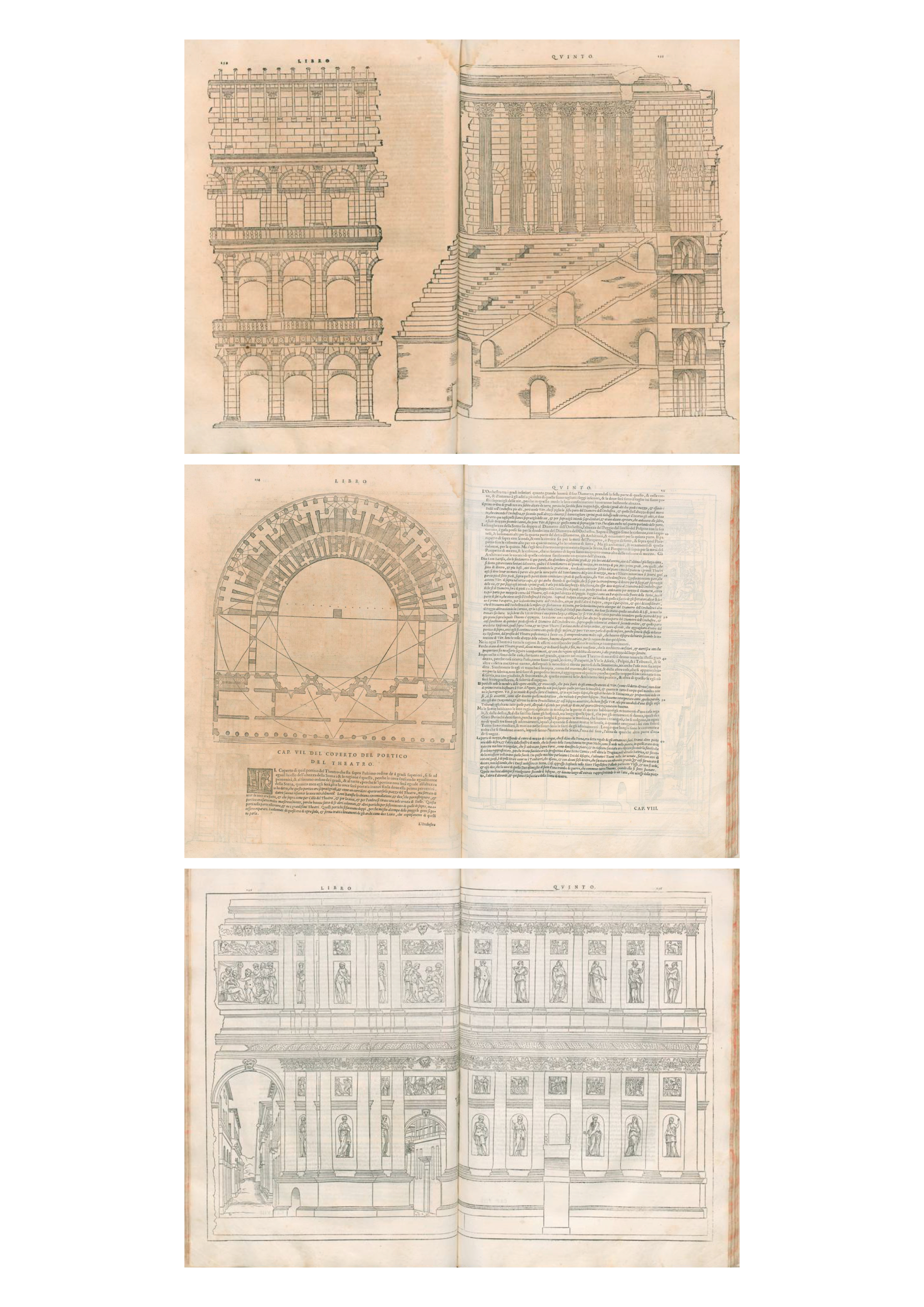
The drawings let me guess that we are looking at an analysis of an antique theatre. On the three spreads are four illustrations: two elevation, a section and a ground plan. What really catched my attention was the fact, that the section claims more than one page. To layout illustrations over two pages makes the book more interesting and varied. It changes the rhythm of the reader and at the same time it enables portrayals in smaller scales. Further to the layout that interests me, there`s a second aspect I want to share. The theater is as already said analyzed by two elevations, a section and a ground plan. Today we don`t need more styles of illustrations to describe an architectural project. That people already knew the three essential ways to describe a building by drawing 500 years ago and that this hasn`t changed by know really appears to me as a surprising aspect
simon zimmermann bubble01-oslo
#20-914-594 #barbaro