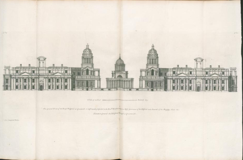
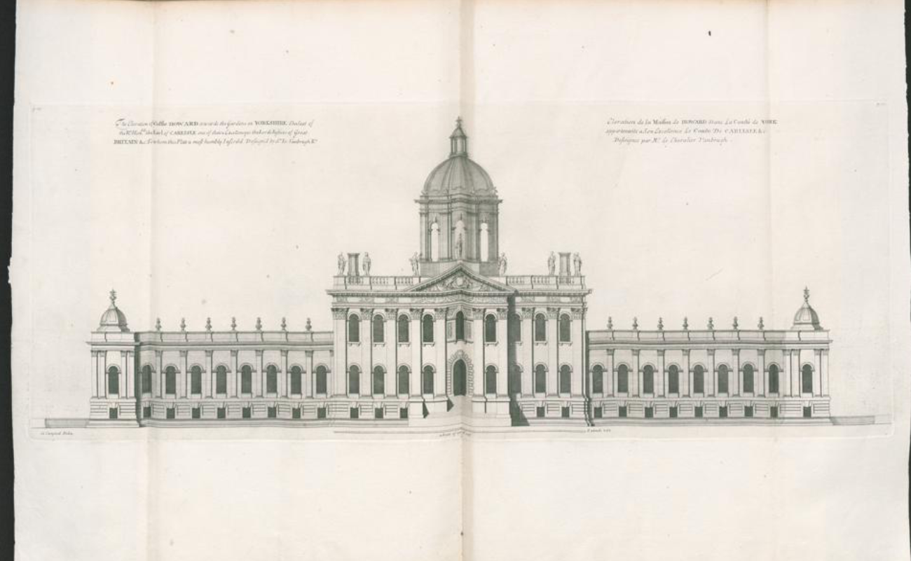
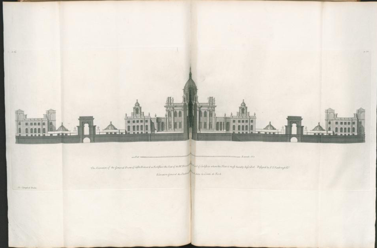
Colen Campbell mostly uses the right site on his book ‘Vitruvius Britannicus’ and leaves the left side blank. Therefore there are only a few spreads and they are only used when the building needs to be drawn over two pages.
All three spreads, as well as most other buildings in the book, show a very strong focus on symmetry.
The first spread shows a building with a beautiful square that is framed by three buildings, with the middle one resembling a religions building and the other two looking more two representative buildings.
The second one looks a representative building that could be found all over Europe.
The third spread shows a beautiful palace complex, again with a symmetrical composition.


